

Letter to Shape Transformation
2022
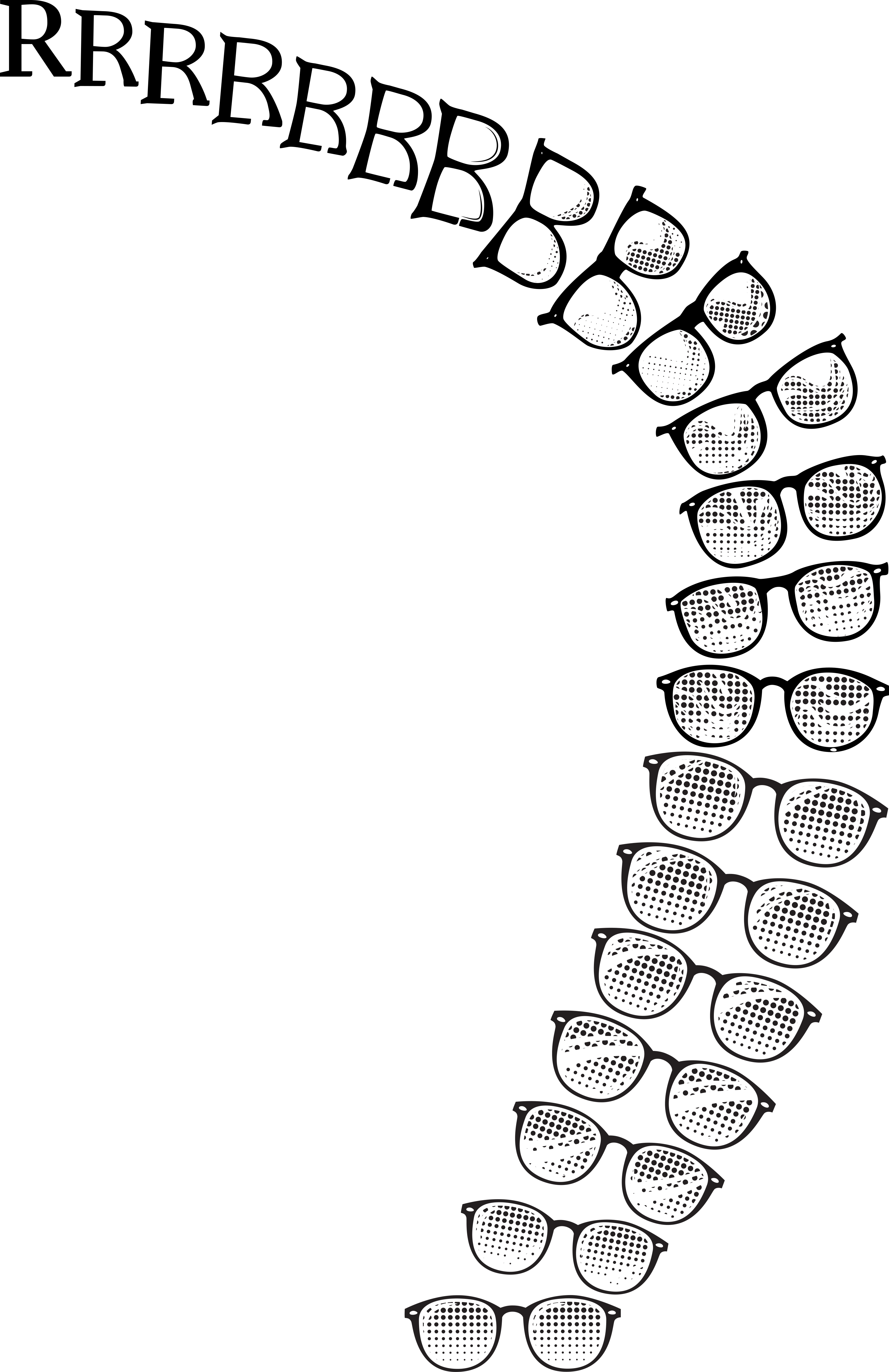
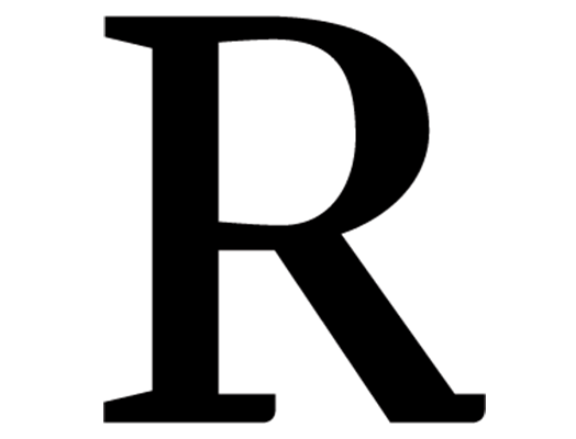
This project was to create a smooth transition from a Letterform to a simple shape. I chose the letter “R” for my name and because I thought it would be more visually interesting and appealing than a “g.” I enjoyed how the thicks and thins and the curvature of the character mimicked the shape of a pair of glasses. e geometric serifs of Eskorte Lan reminded me of the “serifs” on the frames of glasses, where the bows aach to the eyewire so I decided to choose a character from a serif typeface. I added the pointillism lens detail to balance the negative space of the counters of the leer “R.” I wanted the transformation to be smooth and interesting so I added about ten extra frames, so I would have enough to complete the transformation and add a fun motion to the glare on the glasses. If I were to do the project over again I would pay more attention to the differences between the frames. Static, the transformation seemed smooth and appealing, however, once I turned it into a gif I noticed more places where the transformation could be improved if I had more time to work on it. Overall, I am pleased with my product(s) and enjoyed this project.
