


Packaging Design: Retro Kraft
2022
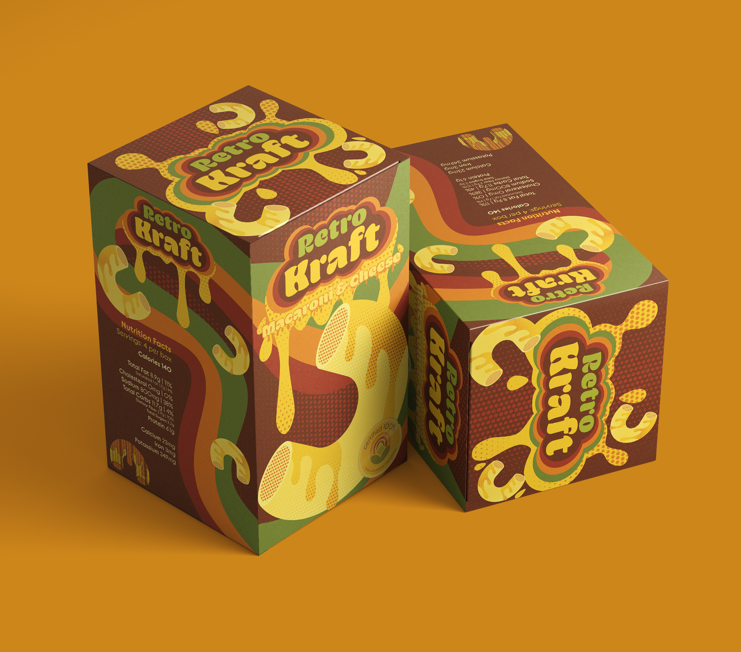
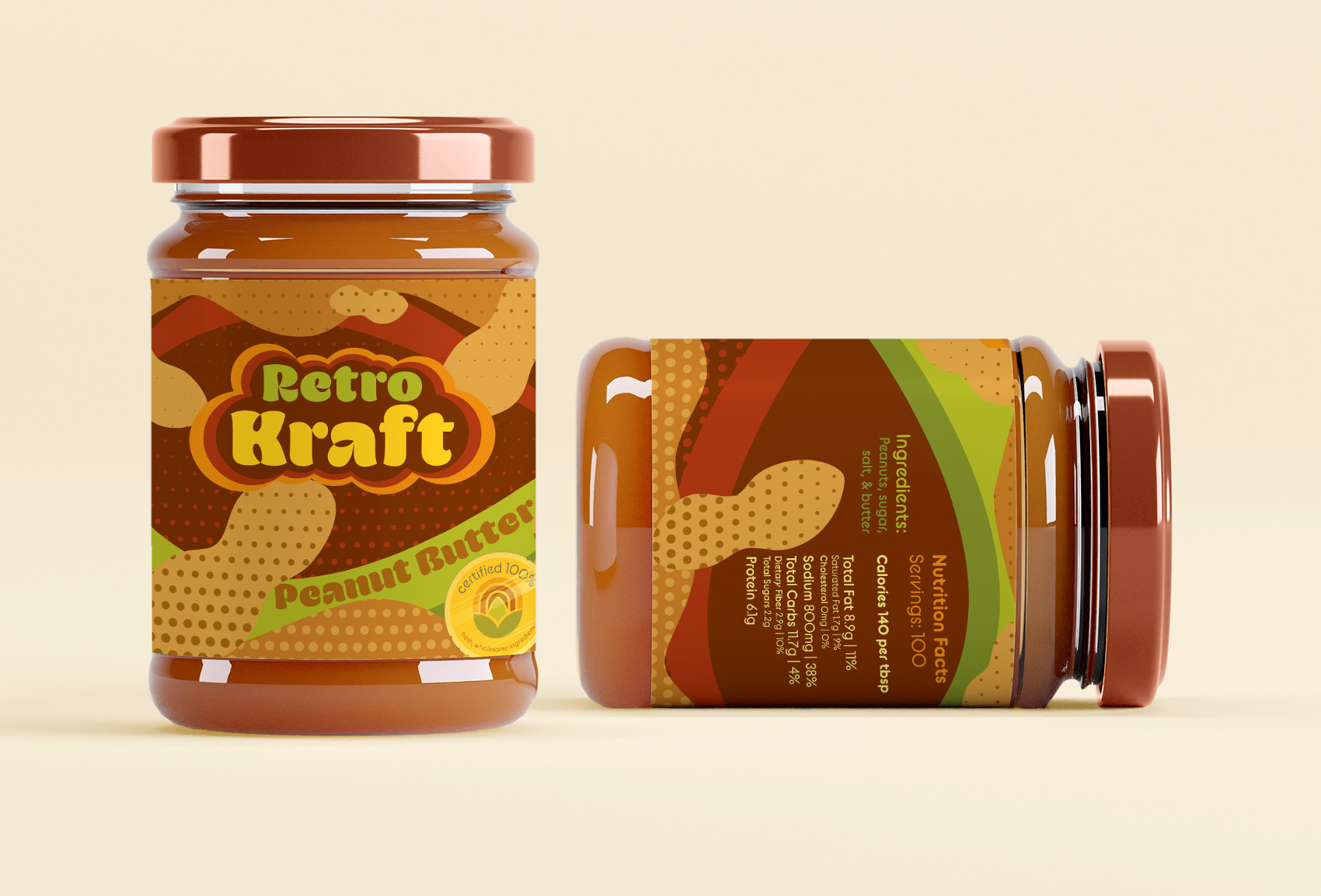
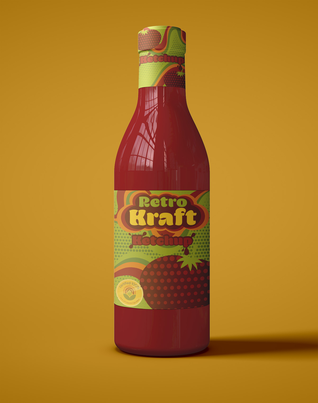
Artist Statement
Inspired to hit anyone born in the 1900s with nostalgia, this post-industrial staple has been a classic for more than a century. Born during the Great Depression, without meat or other perishables it was the perfect, filling meal for a struggling family. Then during WWII, after Kraft created their version, Mac & Cheese really took off because of rationing policies implemented by the government to support war efforts. Because it was popularized during WWII I want this to have a rustic, retro-vibe to contrast the modernist packaging popularized today. Kraft Mac & Cheese is also quite popular in Canada, as many Canadians did not have refrigeration and Kraft Mac & Cheese (also known as Kraft Dinner, or KD to Canadians) required few ingredients. I want to target people who may not currently have children of their own, swapping out bright packaging that would appeal to children for a nostalgic, warm, calm color pallet, after all, Mac & Cheese isn’t just for kids. Mac & Cheese is the pinnacle of North American comfort food, appropriate for all ages. I wanted the packaging to evoke the following feelings; retro, pictorialist, warm, postmodern, vintage, rustic, mature, and comforting.
