


STARLING THEATER CO.
2022
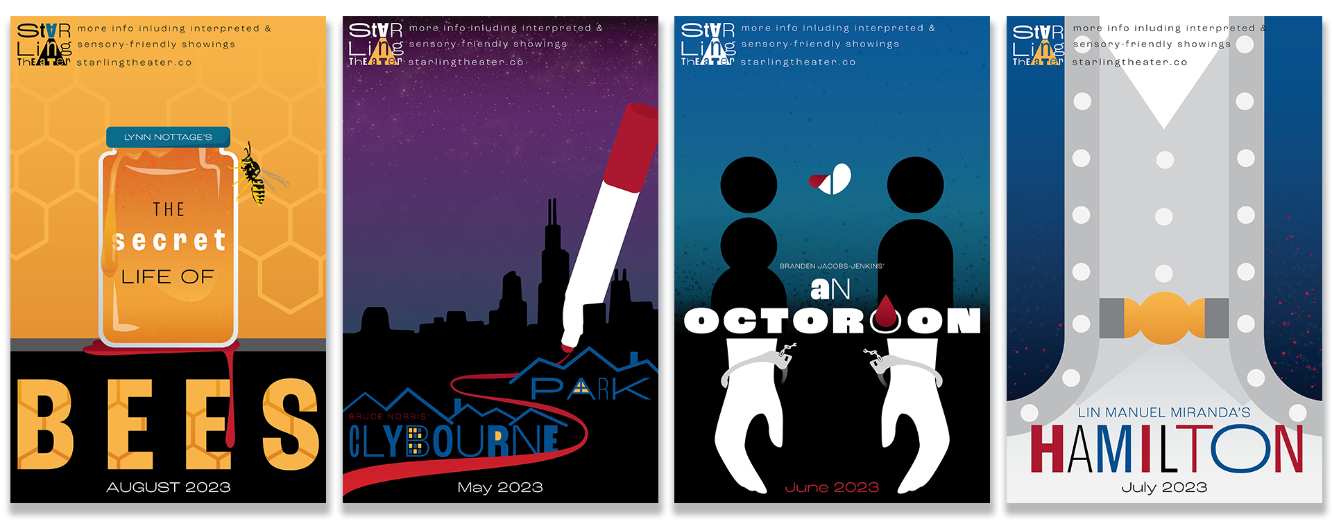
Summary
The Secret Life of Bees is a play about a white woman who flees her abusive step-father after the murder of her mother, and joins a "hive" of black women beekeepers who are very tight-knit. My poster design for this play alludes to the murder through the pool of blood under the jar of honey, thematic of how the main character joins the hive after the death of her mother, I intentionally included a wasp in the design instead of an actual bee, as a representation of the challenges and invaders facing the metaphorical hive of women.Clybourne Park is a sequel to A Raisin In the Sun and is a play about redlining and gentrification a family is facing in Chicago. I included the Chicago skyline as the backdrop, although it is not obvious. The different weights of the letters in the poster design are to signify eclectic neighborhoods in large cities and the variety of residences there. I chose a very metaphorical, almost surreal composition to emphasize the intangible nature of the issue the family faces.An Octoroon is a modernized play based on the classic play, The Octoroon; Brandon Jacobs-Jenson struggled to find white actors willing to play slaveowners so he adapted by casting every character a different race and applying "whiteface," "blackface" and "redface" makeup. The play is about a woman, who is an eighth black in the times of "one-drop rules," although she was lightskin and raised by a white family, after she falls in love with a white man her true heritage comes to light and trouble ensues. I wanted to avoid the explicit depiction of face makeup, so I strived to represent it symbollically. By illustrating a couple and coloring them black I am referencing the unique casting of the actors; the peeling white heart shows the white love that the characters display and how the one drop in her blood is enough to disturb it. The white hands breaking free of chains are a subtle nod to how whtie people were cast to play recently freed slaves; portraying the symbollic emancipation of Black people despite social injustices that still plague their persuit of true freedom. The last subtle nod to the plot is the single drop of blood falling through one of the letters in the title; "octoroon" happens to have eight letters so the light weight and the single blood drop are another symbol of "one drop" rules and the main character's heritage.Hamilton is a very popular play, based on the true story of Alexander Hamilton. I wanted to deviate from typical iconography often associated with the play, particularly the common star logo, quills and weaponry. I illustrated Hamilton's coat and vest, the different weights of text representing the different characters in the cast.
Process
The goal was to unify all four posters, I gave myself the added challenge of ensuring the logo paired well with each illustration. I took inspiration from the Dada art genre because Dada is modern, unique and diverse, like the people that compose the Company. In the spirit of Dada, I used the same typeface for all five elements in various weights, Roc Grotesque. I used the same colorful, diverse pallet for the logo as I did for the posters to create unification. I also sectioned the posters to the same ratio, where the heaviest part of each poster exists in the bottom third.


Artist Statement
Challenged to create four unified posters and a logo for Starling Theater Company's upcoming season, I took inspiration from the art style Dada, because each play features a diverse cast. Any fans of high art will spot the Dada inspiration immediately from the warm color pallet, geometric shapes, minimallist design and varied type weights. I took the liberty of mocking up the logo on various merchandise to show the client how versatile it is.
