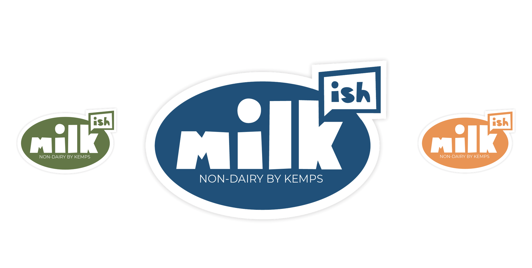
milk-ish: non-dairy by kemps
2022

Artist Statement


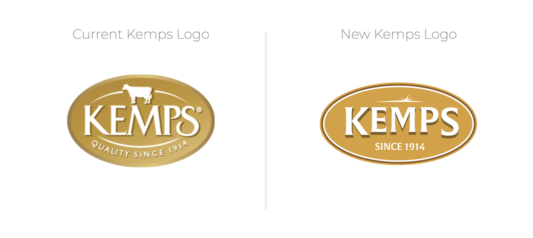
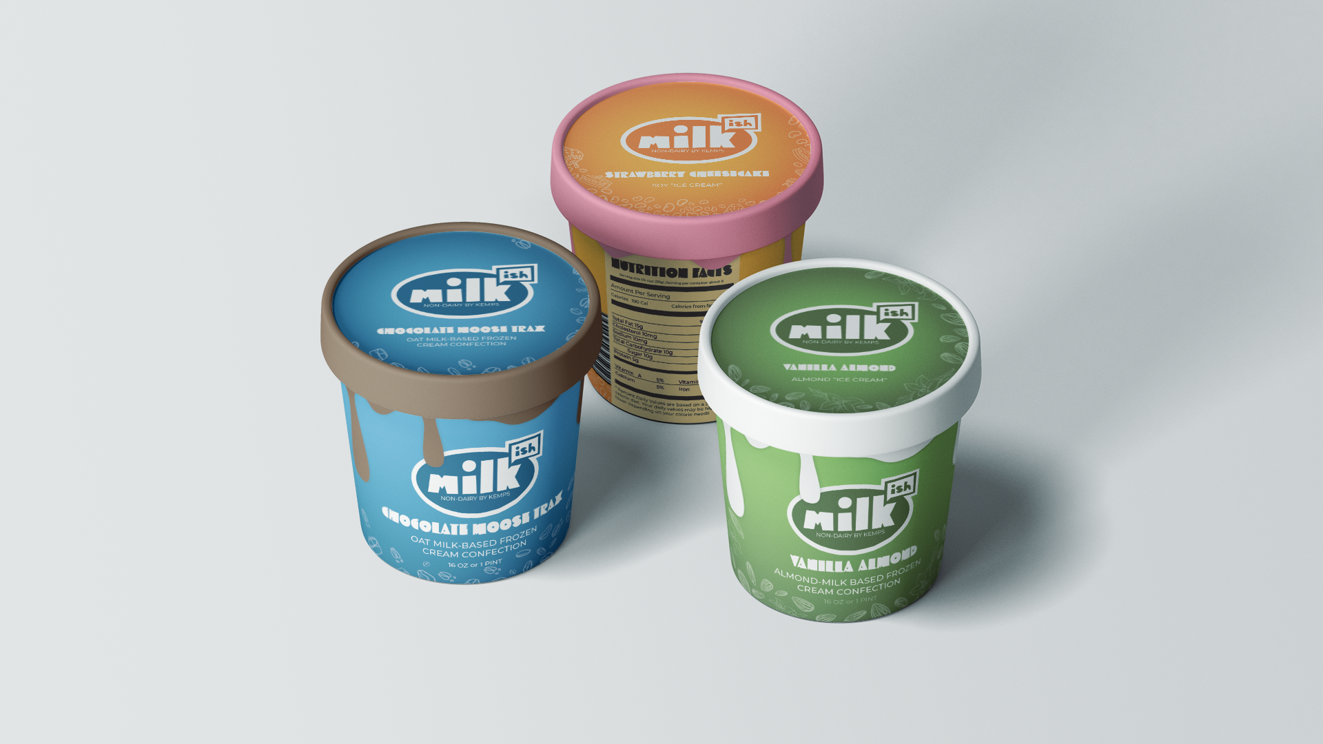
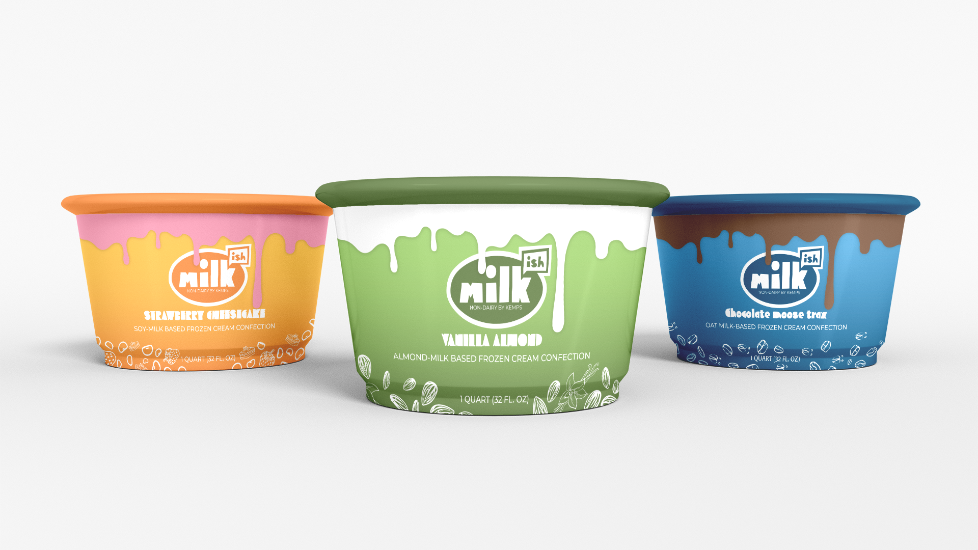
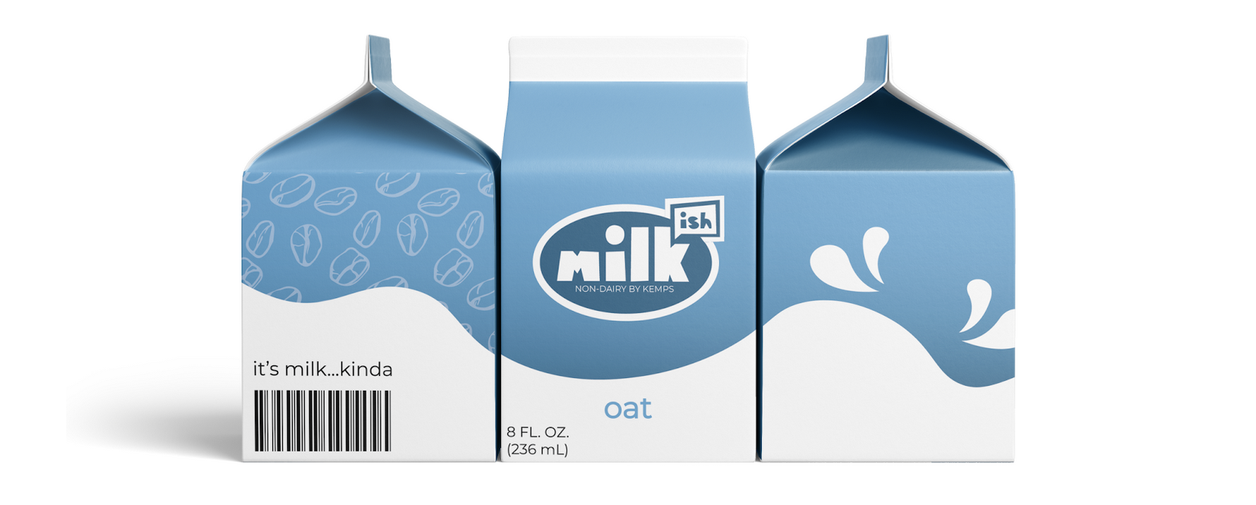
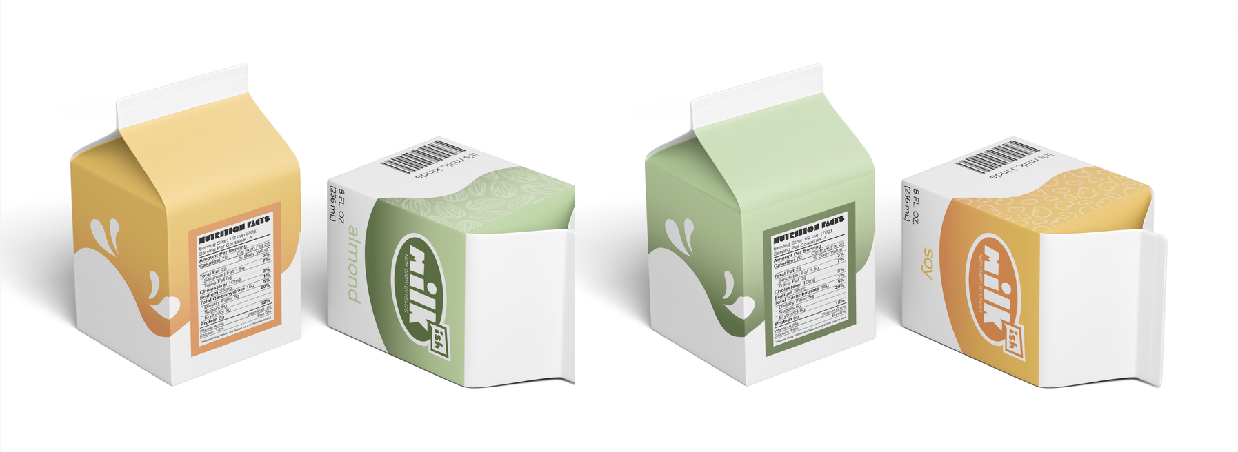
This was a group effort to reinvigorate the Kemps brand. Kemps is founded on traditional values, and of course, cows, so they do not yet offer a product line for people with dietary restrictions. Oat milk, almond milk and soy milk are rising in popularity and commercial dairy is on the decline. We used bright, yet warm colors, and modern & playful typefaces to bring a youthful energy to the brand, and we maintained the Kemps signature oval for the logo for Kemp's new child brand, Milk-ish. We modernized Kemp's logo in an effort to show Kemp's potential as more than a commercial dairy brand, and showing how a "Just Noticable Difference" can renew interest in and distinguish a brand. In addition to classic packaging of mini cartons and ice cream quarts, we created a new way to self-serve milk: the Milk-ish Box. In keeping with the Milk-ish brand of accessibility, we designed packaging for a box-wine style fridge dispenser for Milk-ish products, in an effort to make it easier for everyone to access.
Process
Four of us, Bella Burmas, Ellie Cassella, Brian Downing and myself worked together to create a consistent visual system that could be applied to almost any product line, specifically ice cream and milk packaging. I made the ice cream packaging specifically, but I contributed heavily to the color pallet, typeface selection, and pattern creation.
