Blaine Rebranding
2022


Artist Statement


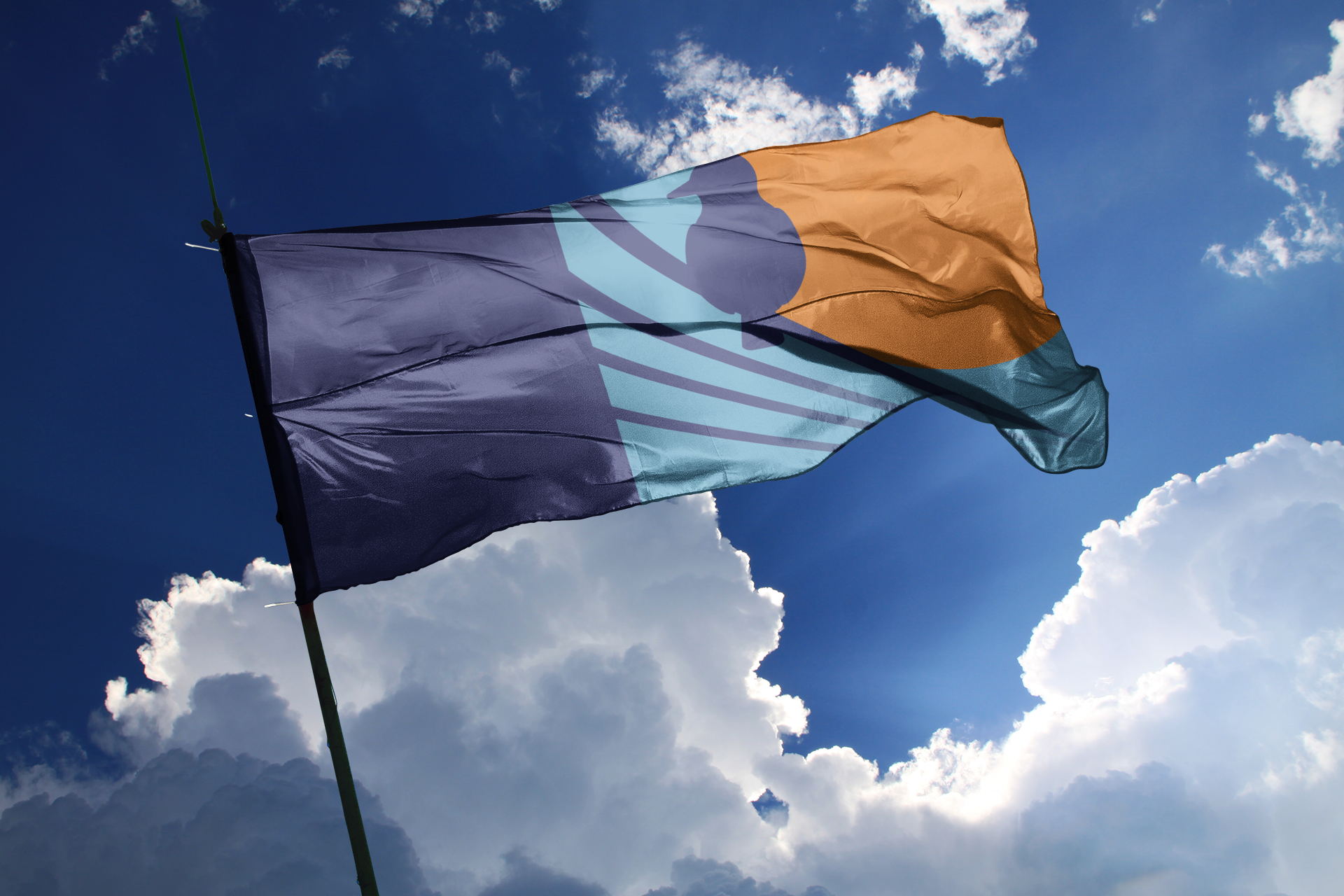
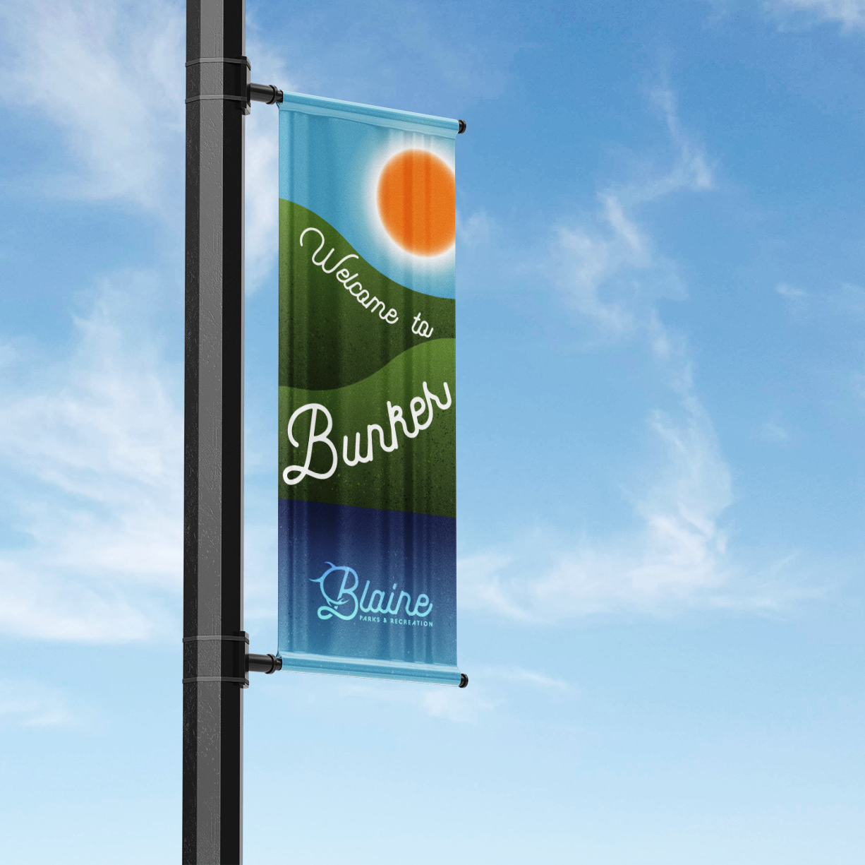
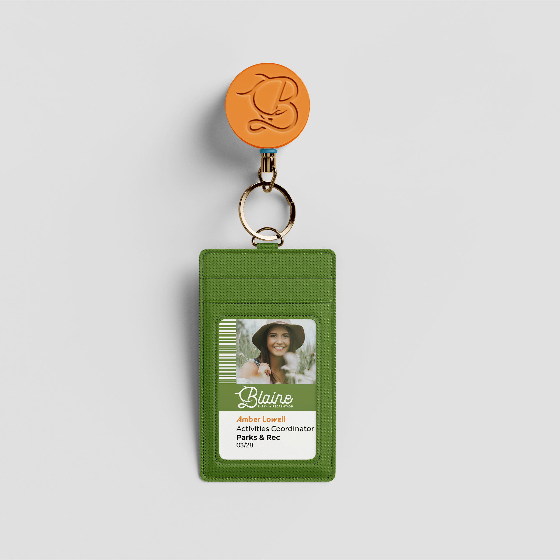
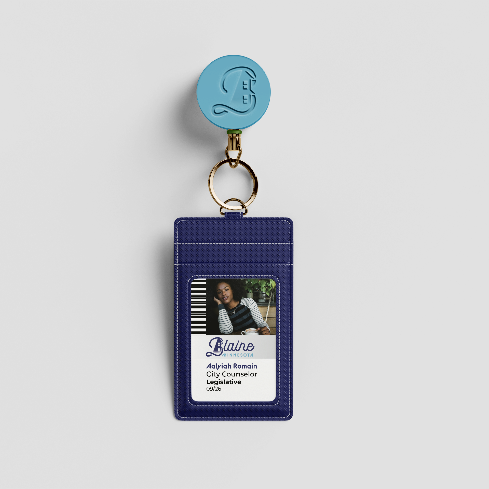
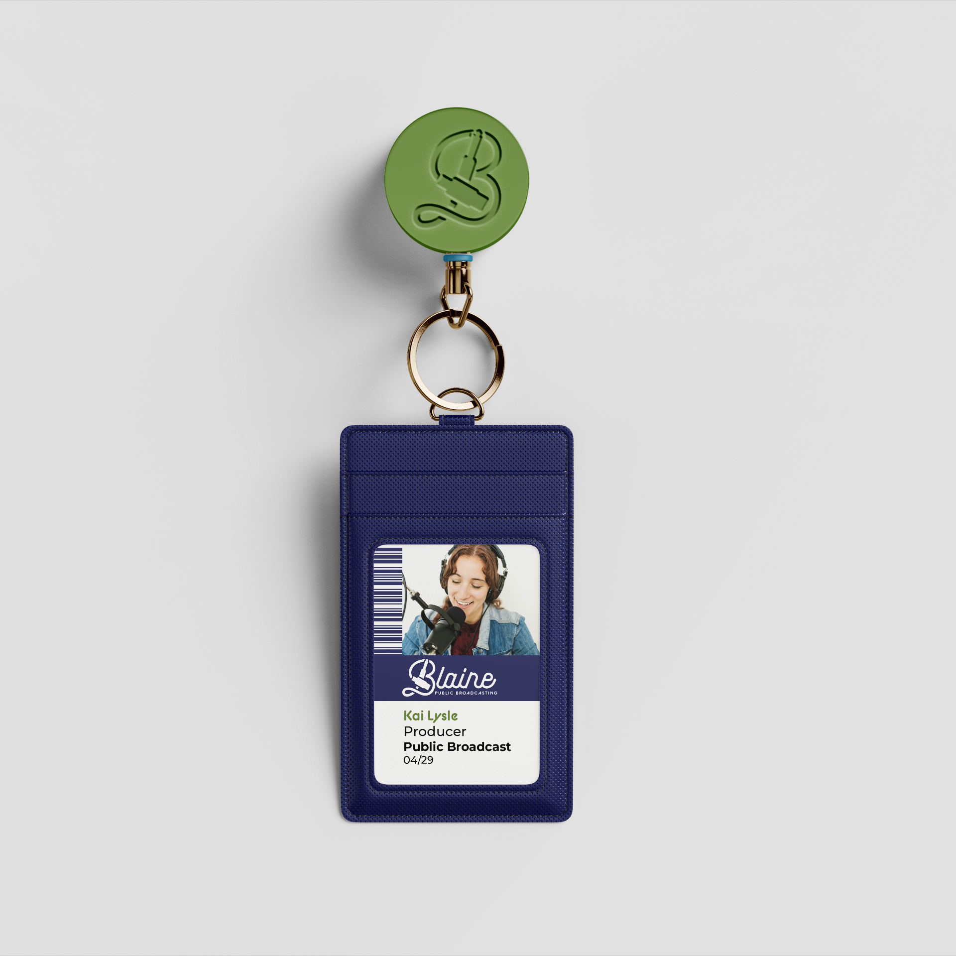
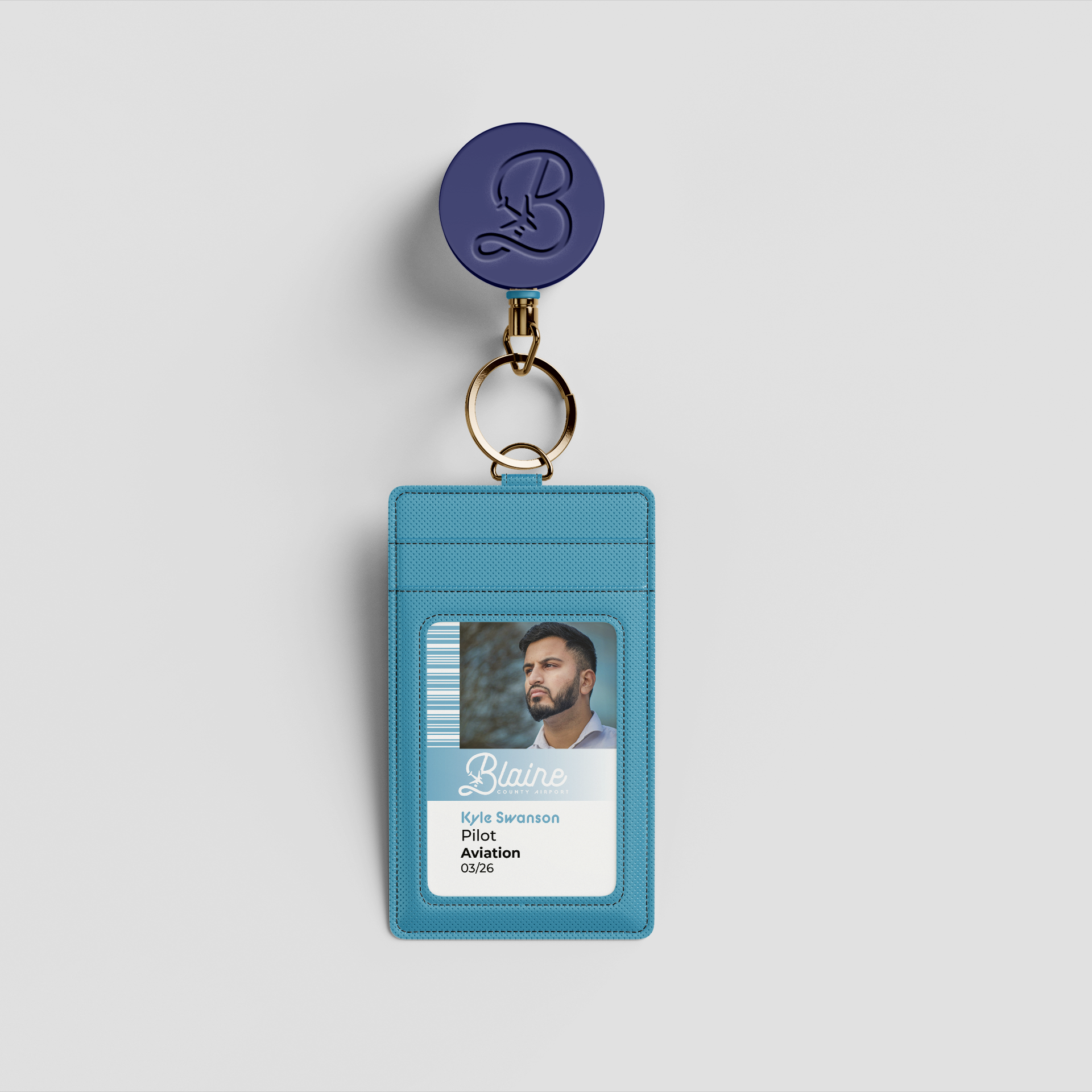
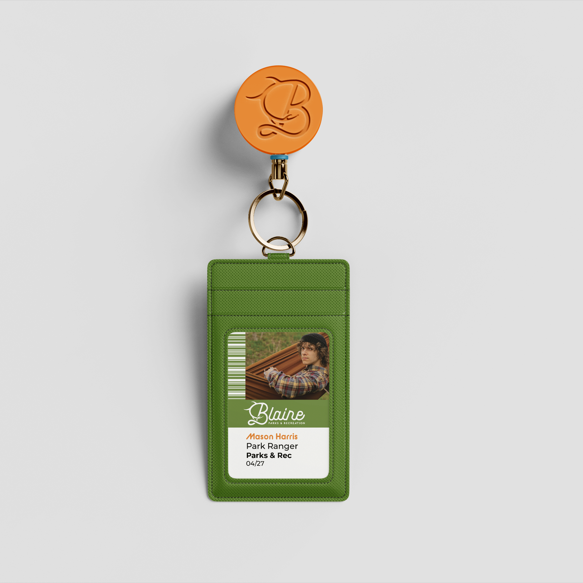
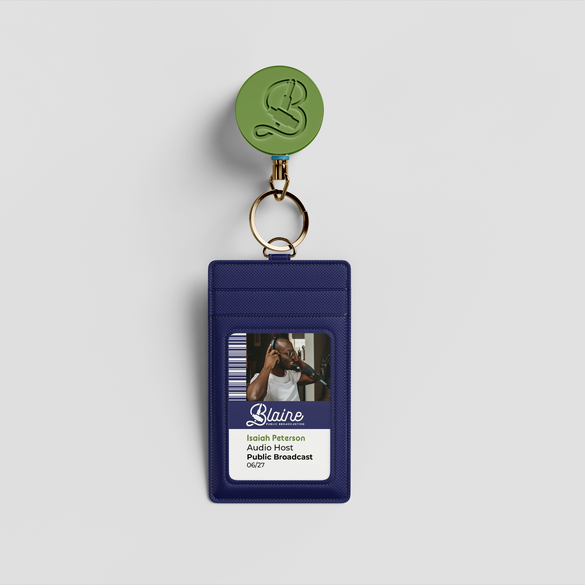
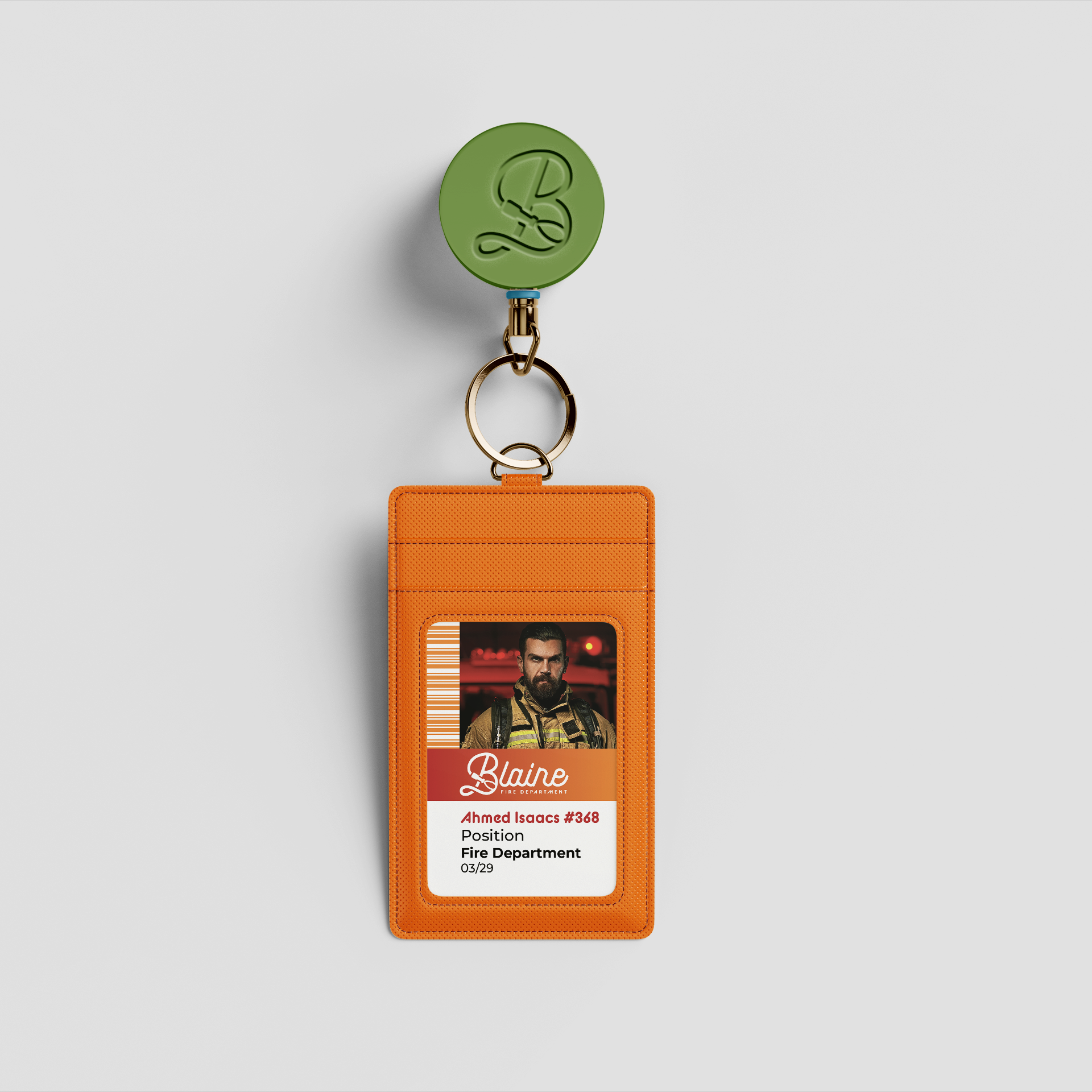
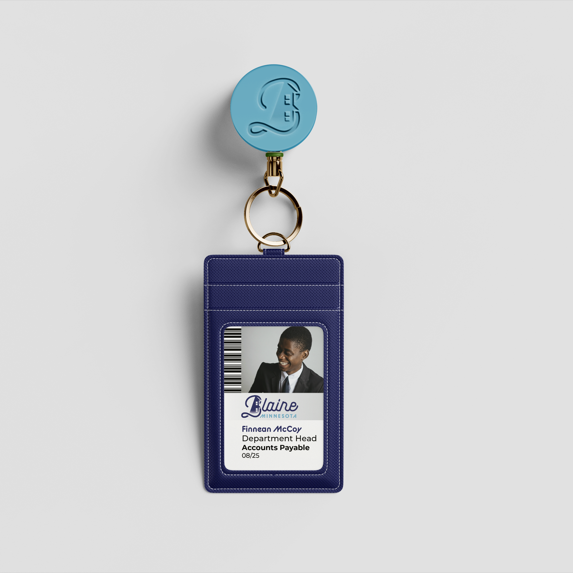
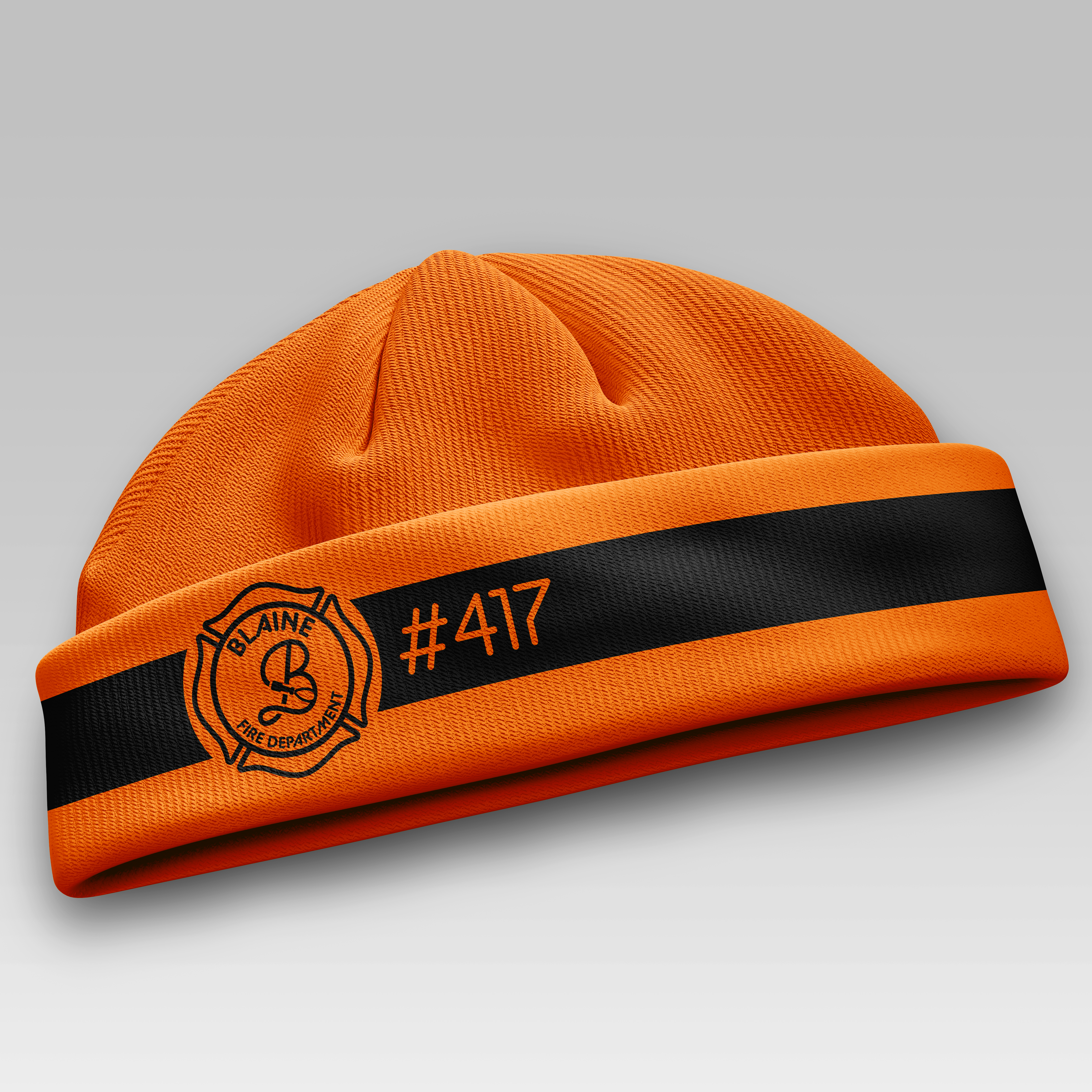
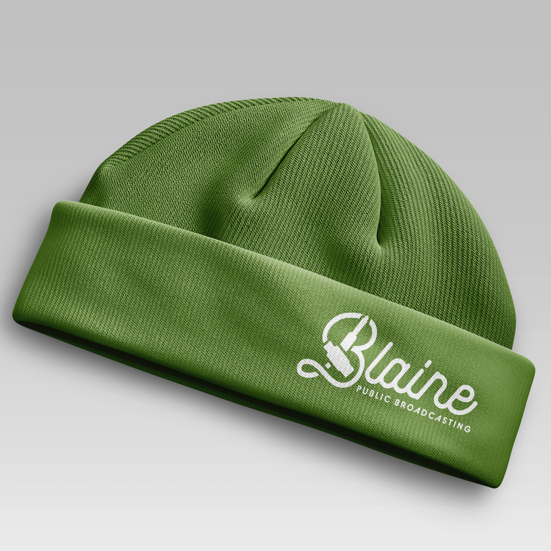
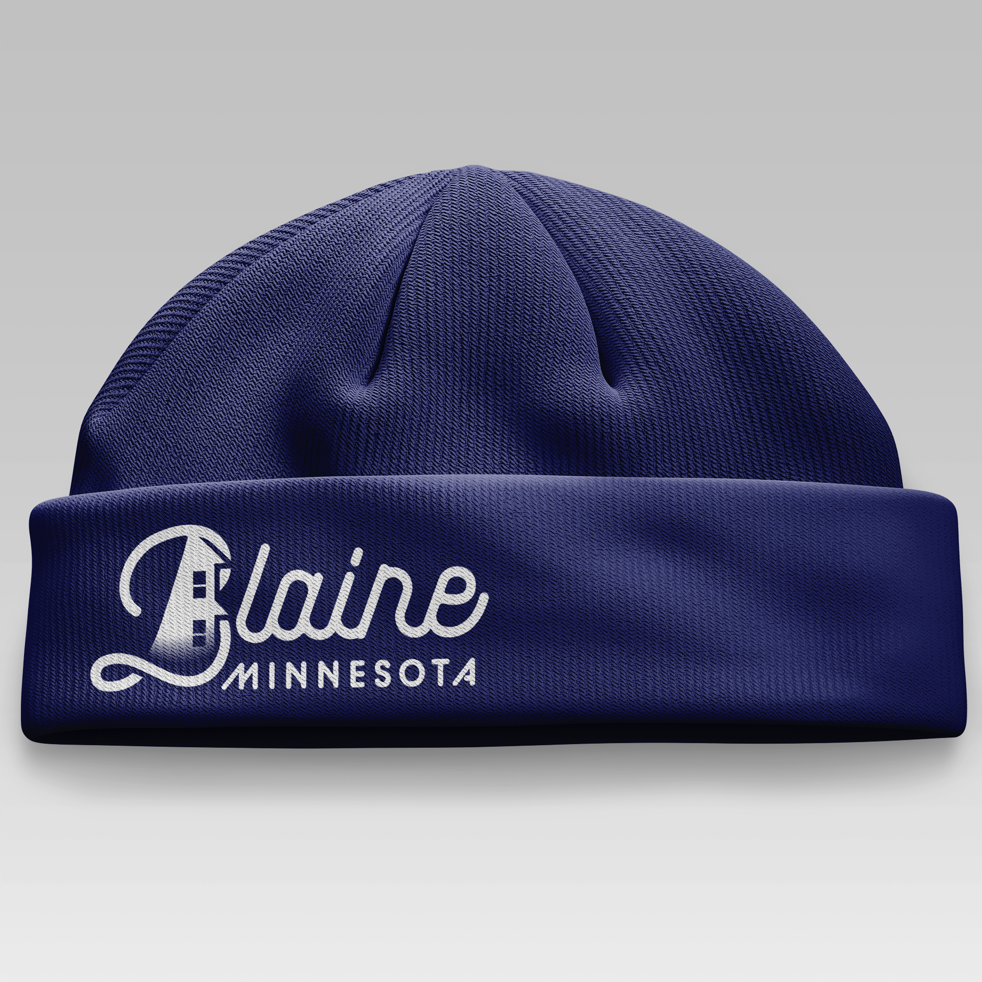
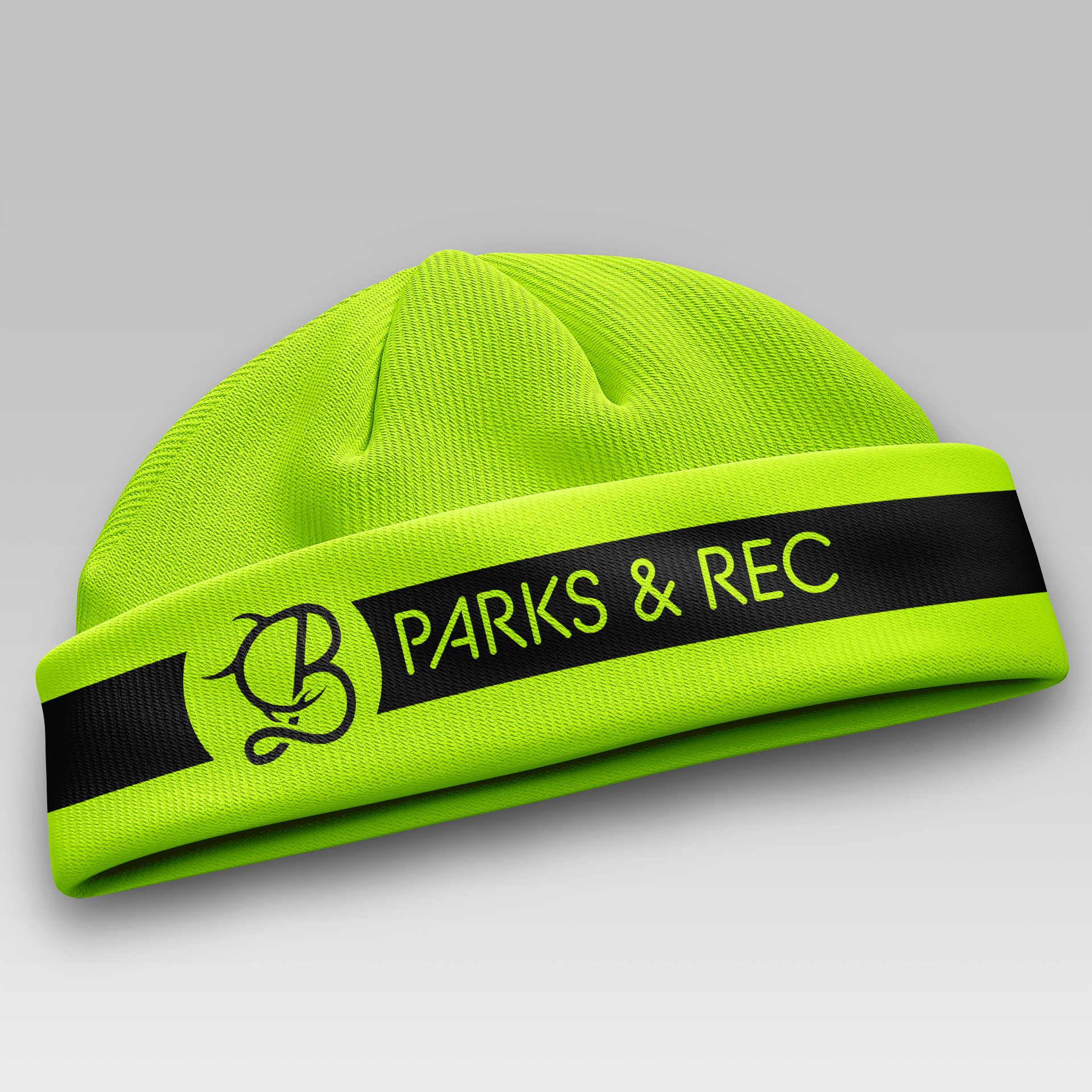
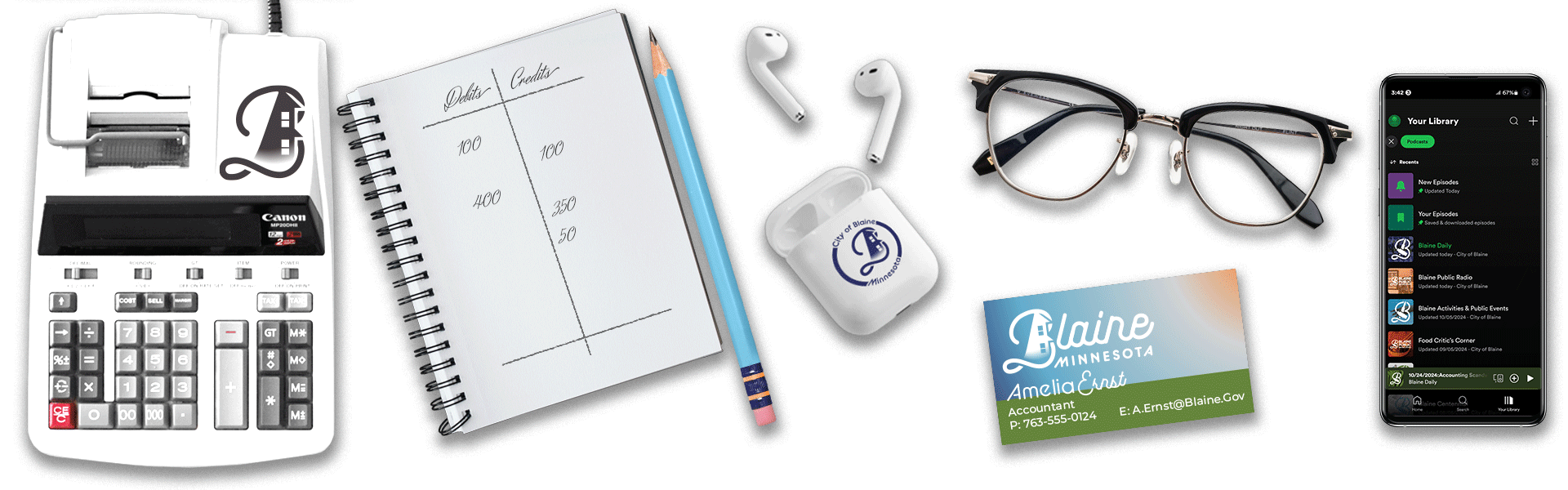
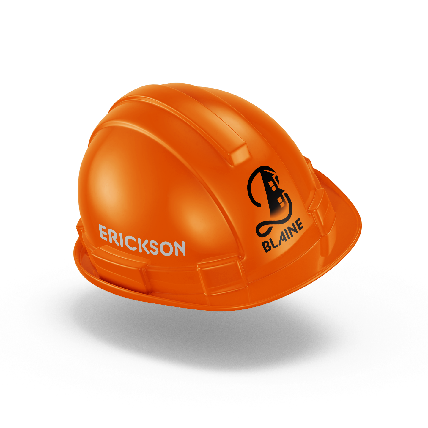
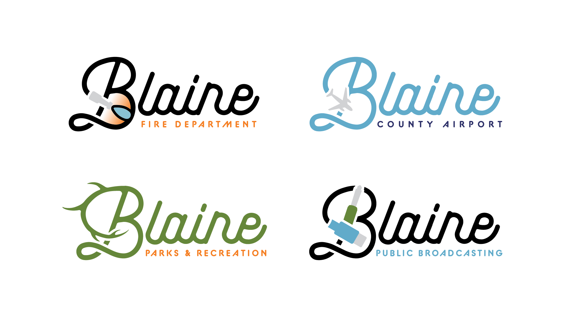
Blaine is a relatively modern suburban town that values environmentalism, science and community. I created a system that utilizes a color pallet to invoke feelings of nature and warmth. The system is versatile enough to be applied to any variety of products or mediums, including social media and merchandise for the public and city staff.
Process
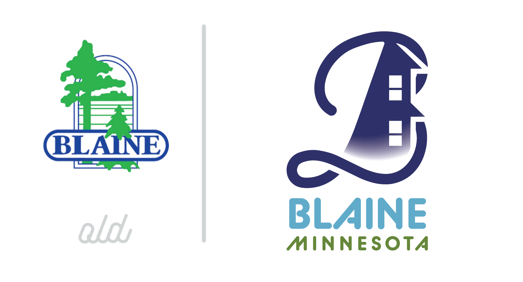
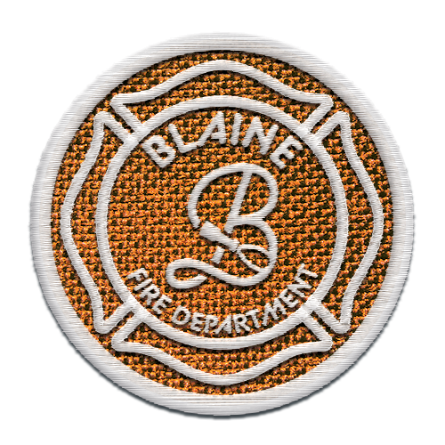
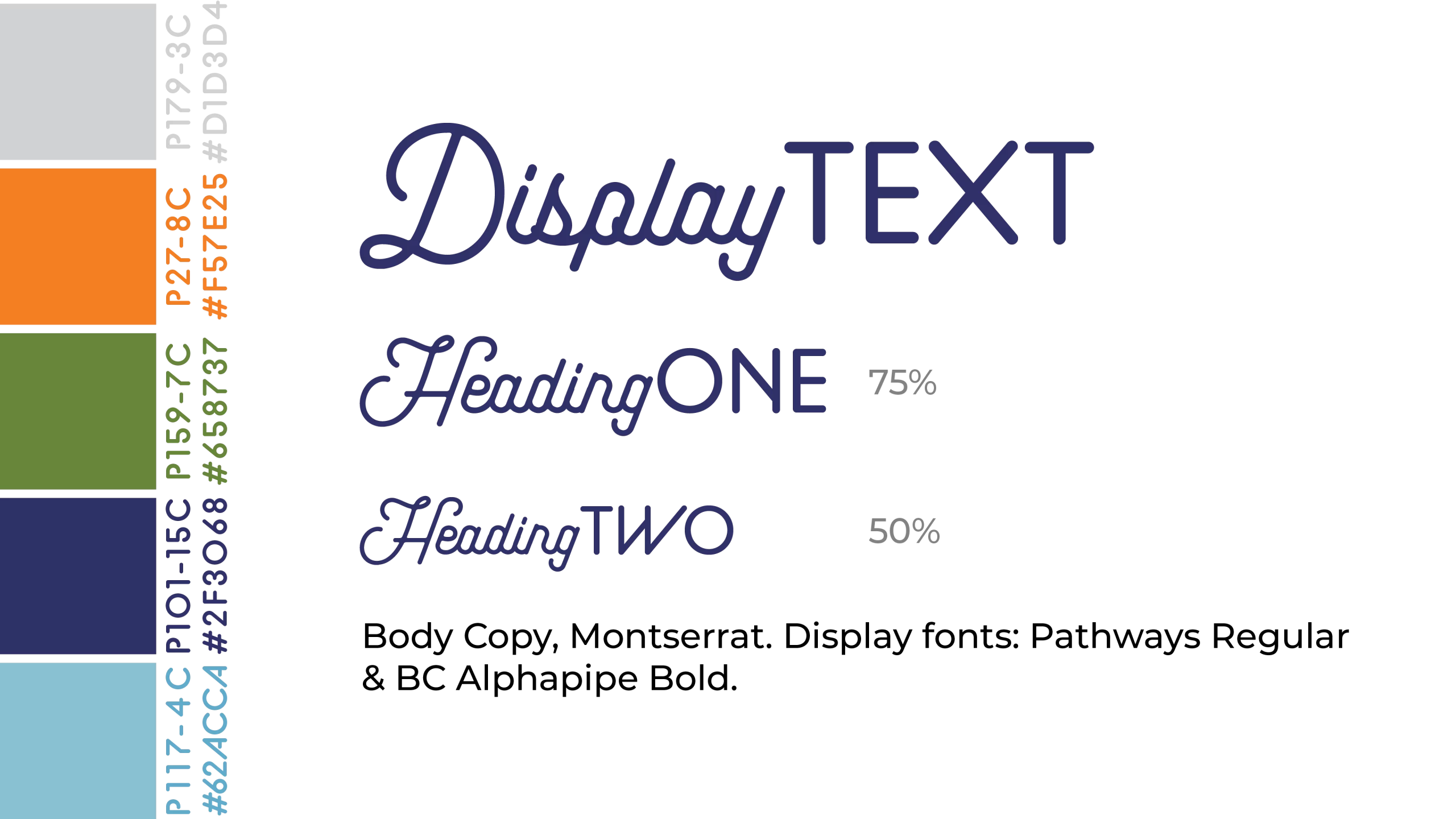
The most difficult part for me was figuring out how to communicate Blaine's values in a single logo. I began by sketching different ideas and creating a color pallet, I found a system with the Podcast and FD icons first, then applied that to my ideas for the main city logo. I chose the font Pathways Regular because it is a beautiful script font, with very clean, geometric lines and rounded terminals all conveying all of Blaine's key values. BC Alphapipe paired nicely, with matching rounded terminals and a very similar slant in some letters.
